I know lists are a little tacky, but I want to share my top five favourite pavilions at this year's Venice Biennale. Egypt, the USA and France are inside the Giardini, while Singapore and Lithuania are near San Marco Square and the Arsenale, respectively.
Singapore

I stay for three loops of this ambiguous cinematic work by
artist Ho Tzu Nyen, a total of 90 mins. This is a record for me, because I
usually have little patience for video art. And no, it isn’t just because of the massive white beanbags. The artist presents a number of tragic
figures, some of which in a way redeem themselves towards the end, all of
different nationalities, ages, and weights – perhaps a reflection of the
cultural melting pot that is Singapore.
The work was dark and dramatic, and beautifully shot. I only wish at least one of the female
characters were presented in a powerful position in the end.
Egypt

Ahmed Basiony was shot in the Egyptian riots in January,
after being selected to represent his country at the Biennale. In his memory, a videoed endurance
performance 30 Days of Running in the Space
(2010), where he jogged for an hour a day in a suit that measured his sweat
levels, is shown beside footage of the riots – a political but effective
move. At the entrance to the
pavilion is the best ‘hook’ I’ve seen at any of the biennale exhibitions: the
last Facebook update by the artist, urging his fellow Egyptian to not give up
the fight. Watching the artist jog
up and down, sweating in a body-shaped plastic bag, knowing his future and the
consequences of recent political events is certainly affecting.
USA

 The art itself is not the best, but I appreciate the dry
humour in Jennifer Allora and Guillermo Calzadilla’s Glory. The
performances on the mock American Airline and Delta business class seats by the
country’s Olympic gymnasts are intriguing but perhaps a little novel, as is the
ATM organ that plays music based on random algorithms when people withdraw
cash. I list the pavilion in my ‘top’ list because of the tank performance
outside the pavilion. Svelte
Olympic athletes intermittently run on the treadmill atop an upturned tank,
seemingly turning the wheels. Not
only does the fuck-off tank demand extra public space outside their pavilion,
but the sound of the frequent performances can be heard across the Giardini,
demanding everyone take notice of the monument to sporting/military/artistic
glory. Art imitating life, or
rather country, really.
The art itself is not the best, but I appreciate the dry
humour in Jennifer Allora and Guillermo Calzadilla’s Glory. The
performances on the mock American Airline and Delta business class seats by the
country’s Olympic gymnasts are intriguing but perhaps a little novel, as is the
ATM organ that plays music based on random algorithms when people withdraw
cash. I list the pavilion in my ‘top’ list because of the tank performance
outside the pavilion. Svelte
Olympic athletes intermittently run on the treadmill atop an upturned tank,
seemingly turning the wheels. Not
only does the fuck-off tank demand extra public space outside their pavilion,
but the sound of the frequent performances can be heard across the Giardini,
demanding everyone take notice of the monument to sporting/military/artistic
glory. Art imitating life, or
rather country, really.
Lithuania

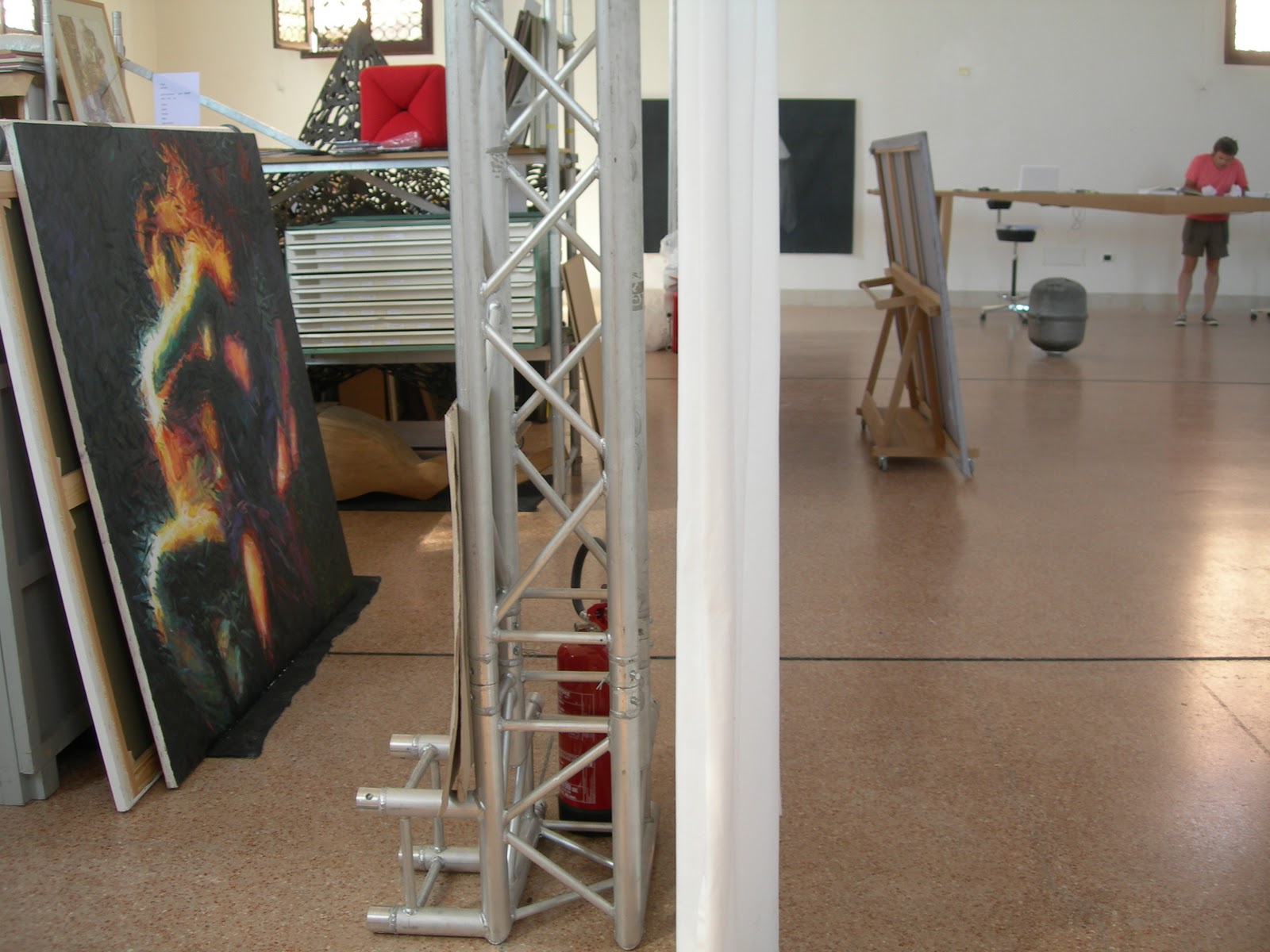 Darius Miksys’ project Behind the White Curtain, is part performance, part installation. He has gathered works by Lithuanian
artists who have received grants from the country’s Ministry of Culture. Viewers are asked to choose works from
the extensive catalogue, which the artist brings out from behind the white curtain
that separates the room. As a
visitor, I’m asked to help curate, to help arrange the works amongst those
previously chosen, some of which are removed if the aesthetic’s not quite
right. Most of the works in the
catalogue are pretty banal, which probably explains why the artist’s asking
whether it represents ‘real’ Lithuanian art. Serendipitously, a week later I come upon a small gallery, Nogueras Blanchard, in Barcelona, where once a week Miksys has been sending a list of
works chosen by visitors (otherwise undisclosed), to be hung unframed on the wall as part of the group
exhibition, Somewhere Else. After the over-publicised hype of the
Biennale, it’s nice to find this unofficial spin-off.
Darius Miksys’ project Behind the White Curtain, is part performance, part installation. He has gathered works by Lithuanian
artists who have received grants from the country’s Ministry of Culture. Viewers are asked to choose works from
the extensive catalogue, which the artist brings out from behind the white curtain
that separates the room. As a
visitor, I’m asked to help curate, to help arrange the works amongst those
previously chosen, some of which are removed if the aesthetic’s not quite
right. Most of the works in the
catalogue are pretty banal, which probably explains why the artist’s asking
whether it represents ‘real’ Lithuanian art. Serendipitously, a week later I come upon a small gallery, Nogueras Blanchard, in Barcelona, where once a week Miksys has been sending a list of
works chosen by visitors (otherwise undisclosed), to be hung unframed on the wall as part of the group
exhibition, Somewhere Else. After the over-publicised hype of the
Biennale, it’s nice to find this unofficial spin-off. |
| Miksys at Nogueras Blanchard |
France
 I’ve had multiple arguments with people over Christian
Boltanski’s installation, Chance, in the
French Pavilion. Apparently, most
don’t share my enthusiasm for the work.
Chance works well with
symmetricality of the neo-classical building, the central section dominated by
a reel of black and white photographed faces threading themselves over, under
and around a heavy structure of scaffolding and rollers. I’ve been watching the artist work in
his studio all year via live video link at MONA in Hobart, so perhaps that’s
why I feel the connection. You
don’t need to be in Venice to win at Boltanski’s chance game either, you can
play at his website www.boltanski-chance.com
I’ve had multiple arguments with people over Christian
Boltanski’s installation, Chance, in the
French Pavilion. Apparently, most
don’t share my enthusiasm for the work.
Chance works well with
symmetricality of the neo-classical building, the central section dominated by
a reel of black and white photographed faces threading themselves over, under
and around a heavy structure of scaffolding and rollers. I’ve been watching the artist work in
his studio all year via live video link at MONA in Hobart, so perhaps that’s
why I feel the connection. You
don’t need to be in Venice to win at Boltanski’s chance game either, you can
play at his website www.boltanski-chance.com
Worst Pavilions
 I wouldn't single them out as the two worst, but you can probably give Latvia and Canada a miss.
It’s hard to use
blacklights in art well, and Latvian representative Kristaps Gelzis didn’t succeed in his exhibition Artificial Peace. The Canadian Stephen Shearer's paintings were cringeworthy to the extreme.
I wouldn't single them out as the two worst, but you can probably give Latvia and Canada a miss.
It’s hard to use
blacklights in art well, and Latvian representative Kristaps Gelzis didn’t succeed in his exhibition Artificial Peace. The Canadian Stephen Shearer's paintings were cringeworthy to the extreme. 
The Italian Pavilion was a definite case of quantity over quality, with a closer resemblance to an amateur community art exhibition than a biennale. The works were crowded on cheap-looking metal racks, and as a result the better works tended to get lost.

Best Satellite Exhibitions

Tra, at the Palazzo Fortuny
Like the site's excellent 2009 Biennale exhibition, the works in Tra sit in dialogue with the decorative and loaded space that is the Palazzo Fortuny. My only criticism is that the catalogue’s images show the
works in isolation, not in the palace space, despite importance of site to the curatorial
premise.
Memory of Books.
Stay away from Chiharu Shiota's installation if you don't like spiders. The maze of string is similar to her work at Detached in Hobart earlier this year.

Afternoon Tea at the Quaffers Pavilion

Run by London-based WW Gallery. After viewing the drawing exhibition in this pop-up gallery, I'm invited upstairs to a traditional British afternoon tea. What's not to like?
Worst Satellite
Future Pass
Read my review of Future Pass here


