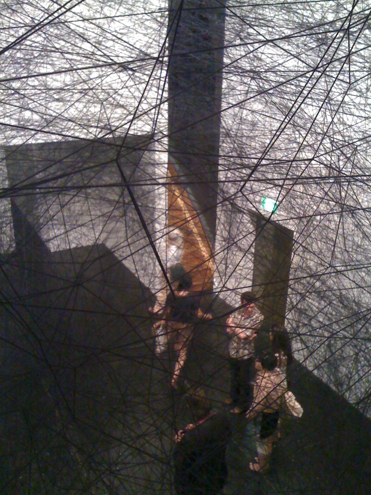
Friday, May 27, 2011

Macro, Rome

After last week’s rant on museum architecture, triggered by two newly built Rome contemporary art galleries, I’m dedicating this comparatively uncritical post to a flaky discussion of some of the works I enjoyed at the contemporary art gallery, Macro.  My original intention was to also discuss the work at MAXXI, the Galleria D’Arte Moderna and the Museo Bilotti, but I need to give my brain a brief reprieve before I start blogging about the Venice Biennale next week. I briefly discuss MAXXI’s architecture in the previous post, which will have to satisfy.

Why Macro?  Because unlike MAXXI, the gallery let me take photos of the art, which makes my life easier (It was made from plaster.  It looked like a lobster. But it was green. It was the same size as a lobster. But perhaps one of the ones that grows off the coast of Tasmania. Oh, I’ve run out of space for anything other than description…).  I can feel a rant on photography in galleries about to spill over, so I might just move on to the art….

As I noted in my previous post, Macro’s been built around a couple of ex-factories: the Peroni brewery and a slaughterhouse, and I’m going to confess now that it was my interest in museum architecture that triggered the pilgrimage to Macro, rather than the art.  I had it in my head for some reason, that Macro was going to be fairly small, but I almost missed my train out of Rome trying to cover it all.  It’s like a maze, a very spread-out maze, which gave the paradoxical impression of being a very empty gallery.  

Ernesto Neto at Macro
Ernesto Neto


The first works visitors encounter are Ernesto Neto’s large ear splittingly loud silver cube, and one of his ubiquitous hanging spice-in-stockings work.  The large space in which Neto’s work is installed is (I’m assuming) Macro’s ‘showcase’ area.  For some bizarre reason, whenever I visit an overseas gallery I encounter one of his works.  I enjoy his clove and cardamom-smelling installations, so perhaps the universe lures me to book tickets to certain locations based on this enthusiasm.  While the scale of Macro’s key exhibition space forces a certain amount of humility in the viewer, it was nothing compared to my experience of his 2006 installation Leviathan Thot in Paris’ epic Panthéon.  Neto’s white bulging organic shapes contrasted in the most bizarre way with the building’s strict symmetry, rich colours and indulgent ornamentation.  The otherwise frosty space was filled with the warm smell of spices contained within Neto’s large bulbous stockings.  In 2006, I’d just finished my undergrad degree in fine arts, and I think this installation was a catalyst for the subject of my PhD: site-specific art.  Basically, what I’m trying to say is Neto’s work at Macro was brill, but I’ve been spoilt by my Paris experience.  

Ernesto Neto, Leviathan Thot (2006), Panthéon

Ridiculously, the other work in Macro’s large space, The Crisis is (Not) Over.  Drawings and Dioramas, was by Dan Perjovschi - another artist who seems to ‘follow me’ OS.  I find his drawings amusing and topical, but I was a little disappointed that the work of a ‘new’ artist wasn’t in that monumental space.  

Dan Perjovschi, The Crisis is (Not) Over.  Drawings and Dioramas


Perino and Vele, Closed for This Week (2002)
I noticed the rough curved concrete supports on the next floor before any of the art.  I was sooooo hoping by that stage that there’d be some sort of didactic text telling me whether they’d bottled beer or slaughtered cattle in the space, but no.  Art was dotted throughout the respectfully white-painted space, such as Perino and Vele’s Closed for This Week (2002), hung between two pillars, and Mario Ceroli’s Goldfinger (Miss) (1965).  I enjoyed the former because it was something that pretended to be another thing, and Ceroli’s work because the ‘back’ of his sculpture still showed the pencil and raw saw-marks of its production.  I think I’ve mentioned my obsession with ‘things that pretend to be other things’ a few times in this blog.  Being in Italy, I probably don’t need to tell you that I’m in trompe l’oeil heaven right now.

Mario Ceroli, Goldfinger (Miss) (1965)
Goldfinger (Miss), detail

Daniel Buren
The Antony Gormley exhibition didn’t interest me very much, nor the sculptures of Sarah Braman, in fact, the room that interested me the most was what you could call a documentary art space, recording the activities of Rome’s alternative art space Galleria L’Attico in the 1960s and 70s. The gallery encouraged cross-disciplinary art, and as I learned from the archived photographs and exhibition posters, it hosted exhibitions by now well-known artists, such as Jannis Kounellis, Joseph Beuys and Robert Smithson.  The posters of Kounellis’ horses particularly caught my attention because Hobart’s MONA has a slightly less high-maintenance work of his that consists of a chair, bowl with knife, and two live goldfish.  If the staff at MONA thought the fish were hard enough, imagine how demanding the horses would be.

A couple of artworks played with the gallery’s architectural features: Daniel Buren’s site specific Dance between triangles and lozenges for three colours (2010) and the art in the two lift-wells, which could only be viewed in full by riding the elevator.  I’m a bit of a Luddite when it comes to video, so you’ll just have to believe me when I write that it’s worth taking the lift.

spotted in the Macro liftwell

Stay tuned for Venice Biennale posts…


Thursday, May 19, 2011

Contemporary art galleries in Rome and the new museum architecture

I’m so lucky.  I’m about to experience the Venice Biennale for a second time as I’ll be working there next month.  In the meantime, I’m studying Italian in Siena for a couple of weeks, and as the title of this post indicates, I just spent a couple of days in Rome.

Galleria Nazionale d'Arte Moderna
So, contemporary art in Rome… unfortunately, I didn’t find any small artist-run spaces (shout out if you know of any), but I visited the contemporary art space, Macro, and Rome’s new mega museum: MAXXI (as in art of the XXI century).  I also visited the smaller private gallery, Museo Carlo Bilotti Aranceria di Villa Borghese, and the city’s Modern art museum, Galleria Nazionale d’Arte Moderna. I very much enjoyed seeing contemporary Italian art, and so I’ll write on the art contained within these museums in my next post, but in this post I’d like to talk about the architecture of contemporary art museums in relation to Macro and MAXXI.

MAXXI: the unassuming streetfront
Macro and MAXXI epitomise the new museum architecture: they showcase innovative architecture while retaining novel elements of the respective original site.  In the case of MAXXI, it’s really only the rather unremarkable (for Rome, at least) street front, but for Macro, it’s features of the gallery buildings’ past functions as slaughterhouse and Peroni brewery (don’t worry, they were separate factories).  I enjoyed both museums, but after visiting a number of galleries whose identity is very much connected to this new style of architecture, I’ve noticed that the declarations of ‘innovation’, ‘difference’ and in some cases ‘challenging the notion of the white cube’, are ironically very similar.

Here are some features of the new museum architecture:

[Update: Dec 2011. I have written a more thorough list at a later post here]

1. Angles. Not right angles, other angles.

National Gallery Victoria (NGV) Australia, Melbourne
Australian Centre for Contemporary Art (ACCA), Melbourne

MAXXI, Rome
2. Floating (or unlikely) staircases.

MAXXI, Rome

Macro, Rome
cage staircase, Istanbul Modern, Istanbul

3. The walls are mostly white, even if they’re self-aware of the white.  Sometimes they’ll have a few coloured walls just to show that they’re slightly subversive.

GOMA, Brisbane
Macro, Rome

The red to break up the white, Macro, Rome

4. (speaking of which...) A touch of red.

MAXXI, Rome
Ceiling, Istanbul Modern
5. Sexy concrete: polished for the floor; brutally raw or curved for the walls/exterior.

MAXXI, Rome


Istanbul Modern
Cer Modern, Ankara, Turkey

6. At least one ridiculously large room, which will often accommodate small objects.  You will look up at the skylights or beams on the roof (oh, so far, far away) like you would in a church.  The room will make you feel insignificant and humble. Art is god.

Macro, Rome
Macro, Rome
Olafur Eliasson, The Weather Project. © Olafur Eliasson. Photo © 2003 Tate, London
Olafur Eliasson, The Weather Project (2004), Tate Modern, in the turbine hall

7. They have toilets with weird sinks. You may or may not get them to function. (I wish I'd taken a photo of the Macro sinks, but it's a bit uncomfortable taking photos in bathrooms)

Gallery of Modern Art (GOMA), Brisbane

8. The building has a previous function as a slaughterhouse, factory or similar (usually) industrial structure:

Macro (ex-slaughterhouse, Peroni factory)

Istanbul Modern (ex-shipping warehouse)

 
Detached, Hobart (ex-Church)

Cer Modern, Ankara, Turkey (ex-railyards)

Tate Modern
Tate Modern, London (ex-powerstation)
okay, it's not a gallery per se, but Cockatoo Island's a popular venue for the Sydney Biennale (ex-shipyards, gaol). It's similar to the Venice Biennale's arsenale in this way.  The use of industrial structures for temporary exhibitions is a whole other post...

9. Exposed plumbing or other functional parts of the gallery (also to show awareness of the white cube shiz) 

Pompidou, Paris

Istanbul Modern

MONA, Hobart

10. Rust fetish.  If the rust was not already part of the building prior to its current function as a gallery, ‘new’ rust is manufactured.  Rust fetish not only refers to literal rust, but also aged features in general - old machinery, crumbling bricks, old graffiti...

ACCA, Melbourne (new rust)

10. Site-specific art that responds to unusual or novel aspects of the architecture.

GOMA, Brisbane
Daniel Buren, Dance Between Triangles and Lozenges for Three Colours, Work in Situ (2010)
, Macro

11. A will to get visitors lost.

MAXXI
MONA

12. A funky gift shop, expensive restaurant, and similarly overpriced café.  It will have all three.

Cer Modern
Tate Modern (image credit: Splash Magazines)
Istanbul Modern (image credit: Tesker)
GOMA, Brisbane (with water dragon)

As I wrote earlier, my next post will be on the art contained within the respective museums, but I just had to get this ‘new museum architecture’ theory out there.

Friday, March 25, 2011

10 Days on the Island starts today

10 Days on the Island, Tassie's hyperactively-promoted biennial arts festival starts today. Well, unless you're a visual arts event, in which case you've been up and away for up to a week. 20 Days on the Island? I calculated yesterday that I'm personally 2584 days on the Island. You can probably tell I'm doing a PhD (or similar procrastination-rich study).

This is not a critiquing post, because I've been hibernating and haven't seen anything yet. It's more a 'this is what's on, and this is what I plan to see' post. The major constraint, as I've mentioned in other posts, to seeing 10 Days events is cost. I can't afford to attend most events. The one paid event I'm making my priority is Power Plant at the Botanic Gardens. It's $15 concess, $25 full, which is on the very low end of the paid scale. I'd love to see some of the music events and the theatre, but on a student wage, the cost is prohibitive. I think MONA FOMA has spoiled me! The cost structures are incredibly strange. Take one music event, DBR and DJ Scientific with Emeline Michel: It costs $25 in Hobart, but it's free in Launceston. If you have 5 people in the car, it's far cheaper to drive to Launceston from Hobart to see the show. If anyone can explain the reasoning behind this discrepancy, please do!

Anyhoo, I shouldn't really have a whine. There are free events, such as the visual art events (because visual artists aren't paid as much as other performers?). In the south, Reconstructing the Animal, curated by Yvette Watt, and held at the Plimsoll Gallery, and interestingly, the old Beaumaris Zoo site. Craig Walsh's Digital Odyssey is also at the top of the list. Rather than just be a 'gonna', I need to crack my cocoon and go see some of this stuff. Will post reviews soon....

Saturday, January 15, 2011

MONA FOMA: twittering micro critic

Over the next week I'm acting as a MONA FOMA microcritic for ABC local radio (936).

As I've mentioned in previous posts, (which can be viewed here, here, and here)  MONA FOMA is a music, sound and art festival with an emphasis also on food and wine.  This year's MONA FOMA is also a lead up to the much anticipated opening of MONA, David Walsh's exciting new museum.

Four local tweeters and I have been chosen to critically tweet throughout the festival, which officially opened yesterday.  I'm already exhausted, as is my data allowance (I'm lucky enough to have my monthly cap refreshed tomorrow, however). I tweet under the name of @stealthpooch so if you're on twitter, please follow, whether you're local or not, and share the experience with me.  If you're not on twitter, I've also added my twitter feed on the sidebar of this blog, so you can read my tweets that way. Otherwise you can also subscribe via an RSS feed.

If you are local to Hobart, I strongly urge you to attend both the festival and the museum opening.  The festival is almost completely free, with the exception of a Philip Glass performance and the Grinderman concert.  At the festival, there are fantastic sound art exhibitions, performance art, bands, cooking demonstrations and great wine and beer, and the museum will blow your mind.

Just do it.

Friday, January 7, 2011

Sculpture by the Sea: regressive and irrelevant?

Sculpture by the Sea needs a rethink.  Every year in November, I make the pilgrimage to Sydney to see the annual outdoor sculpture exhibition, where sculptures are installed along the picturesque cliffs from Bondi to Tamarama.  However, after this last experience (2010) I don’t think I’ll bother anymore.  Sculpture by the Sea (SS) has become commercial, boring, sameish, and conservative.  None of these criticisms, particularly my concern with the commercial emphasis of the festival, are bad per se as I know that large scale exhibitions need to be funded from multiple sources. However, the combination of these critical issues is turning what was initially an innovative and interesting exhibition, into an event that is losing relevance to many contemporary practicing artists, and ignoring the site’s true benefit, that is, its potential for site-specific art.

One of the few truly site-specific artworks in 2010: recycled plastic bottle 'icicles'
 Stylistically, most of the sculptures bear few similarities to the sculptures shown in contemporary galleries or even at other popular outdoor exhibitions around the world.  One of the things I’ve noticed over the years is an increase in monumental cast or assembled metal works, often bronze, and either rigidly abstract or nauseatingly figurative.  This last exhibition, in fact, gave me a sense of deja vou – it seemed that they’d re-exhibited the works from 2009.  Now, I have no problem with abstract work, nor bronze as a material, however, the works were so Caroesque that I was reminded of Charles Green’s comments in his book Peripheral Vision.  Green describes the gulf between the ‘older welded-steel sculptors and the younger post-object artists’ at the significant Mildura Sculpture Triennial one year.  Apparently, this evident generational gap ‘led to the enclave of formalist works being labelled “Karo Korner”’ (Green, 1995 p. 17).  I want to highlight the date of the exhibition: it was 1973. I believe that contemporary art has well and truly moved on from these traditional styles, styles that were becoming quickly irrelevant 40 years ago.  Of course, such sculptures are interesting when considered in their historical context, however I fail to see the relevance of such heavy, masculine, and permanent works (and I emphasise the more negative connotations of the adjectives) to contemporary culture and society.  Evidently, most museums and artists agree, and it’s really only at SS that I’ve witnessed such a popularity in this conservative and traditional artform.  I should probably add at this point, that Sir Anthony Caro was actually invited to exhibit in the 2010 SS.  I laughed when I saw his work, because I came across the massive structure plonked on the grassy cliff just as I was explaining to my friends what I mean by ‘Caroesque’.  I also need to emphaise that I enjoy Anthony Caro’s work, and my objection to the SS’s ‘Karo Korner’ is merely concerned with its relevance to 21st century art practice.

So why is SS so regressive in their choice of artwork?  I understand that the works have to be durable due to their windy outdoor site, yet the exhibition is only for a couple of weeks and there are plenty of other materials and styles that can withstand such weather.  Perhaps it’s because most of the entries embraced more traditional materials and subjects; although I doubt it, because not only do most practicing Australian artists work in more contemporary media (based on what I see in both commercial and public galleries, artist websites, and my friends and colleagues’ work), but I know of many excellent and high-profile artists being turned down for proposals that engage with the site in relevant and interesting ways.  I also know that in past SS exhibitions, there have many more site-specific works of art.  My guess is that such sculptures sell.  Site-specific installations, regardless of their merit, do not sell as well as stand-alone works, simply because they often require a dialogue with the site to work properly.  Additionally, in terms of materials, bronze is easier to sell (particularly to a conservative public) because of its associations with wealth, permanency and tradition.  These works are safe; they don’t challenge the definition of art or cause controversy.  Yet, the sheer number of them in the last few years of SS has made the exhibition just that: safe, traditional, boring and conservative.

Imagine how innovative and interesting SS could be if they had more works that actually interacted with the site.  The landscape is incredible and calls out for playful and relevant artworks.  The cliffs, the thrashing waves, the wind, the sand, the handrails, the plants gripping onto the cliffs, the dripping water, the salt, the tourists, the gentrification of the area’s housing, the caves…  I mean, the site wants to be in dialogue with the sculptures, and yet the majority of the sculptures are simply ‘plonked’ there.  While public artworks for the last 40-odd years have been moving towards interactivity and relevance to the historical, special or cultural aspects of their respective sites, SS is regressive, returning to a pre-1970s public art and ignoring the wonderful developments in outdoor art which have flourished since Christo wrapped Little Bay in 1969. 

Let’s be proud of our country’s outstanding contemporary artists and make sure that SS, as one of the most popular and high-profile outdoor exhibitions, does justice to our thriving art scene.  For if I was a tourist from another country and witnessed only Sculpture by the Sea as illustrative of 21st century art in Australia, I’d think were stuck in 1968.